Reporting to Three Audiences
The team, the team lead and the executives need different slices of the same truth - what each audience should actually see, the numbers I put in front of a boardroom, and dashboard principles that skip the red-amber-green pantomime.
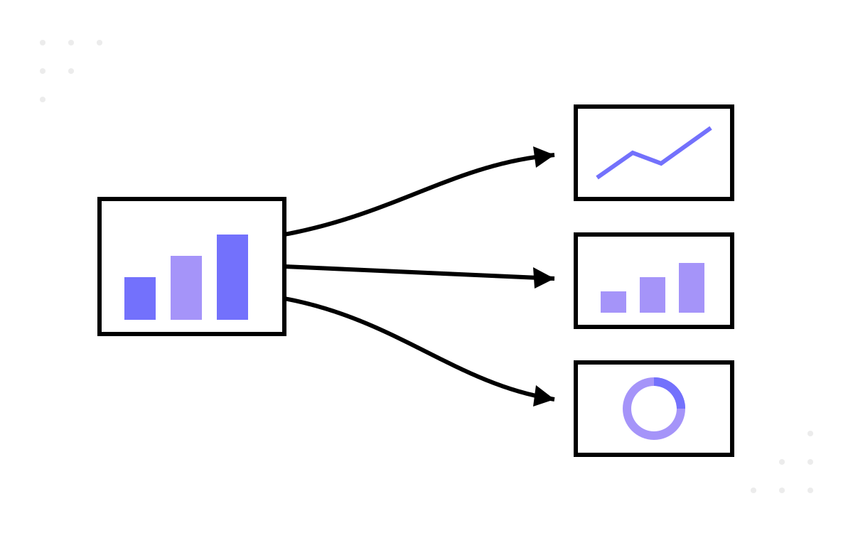
Part 11 ended with the numbers arriving without ceremony — captured on defensible definitions, updated without anyone typing into a spreadsheet. Which is where a subtler failure begins, because the most common reporting mistake I see is not a wrong number. It is the right number shown to the wrong audience: the executive squinting at a cycle-time scatter plot, the delivery team presented with a quarterly lead-time trend they can do nothing about this week, and — worst of all — one dashboard built for everybody, meaning nobody. Measurement serves three audiences, and they are not asking the same question of it.
Three audiences, three questions
The division I work to is simple, and I hold to it because every reporting failure I have untangled turned out to be a question answered at the wrong altitude.
The team asks an operational question: where is work stuck, today? They need instruments they can act on before stand-up ends — current WIP, the state a slow item is sitting in, the bulge forming on the cumulative flow diagram. Cadence is daily; the format is a live dashboard the team reads itself, not a report prepared about them.
The team lead asks an evaluative question: is the change we made working? A new review rota, a WIP limit, a definition-of-done tightening — each is an experiment, and experiments need trend data over sprints and months, not this morning's snapshot. Cadence is per sprint or monthly; the format is a trend chart with a written narrative, because a slope without an explanation is an invitation to guess.
Stakeholders and executives — directors, product owners, the C-suite — ask an outcome question: is engineering converting effort into business value, reliably? They need few numbers, trended over quarters, connected to consequences they recognise. They do not need, and should not be shown, the operational layer; an executive reading team-level WIP is either bored or about to micromanage.
A metric is not reportable in the abstract — it is reportable to an audience, at a cadence, in answer to that audience's question. Most of this part is the working-out of that sentence.
The team's view is a mirror
The team layer needs almost no design, because the instruments from earlier parts already live at the right altitude: the cycle-time scatter from part 11, the cumulative flow diagram, the WIP count, and — where you have it — the time-in-state breakdown that says which queue is eating the week. The one design decision that matters is ownership. This layer is a mirror the team looks into, not a window others look through; the moment it becomes surveillance, part 1's law arrives on schedule and the board starts being groomed for the audience.
Two working rules ride alongside these instruments in my own teams, and I want to be plain about their provenance: they are my recommended practice, built from estates I have worked on, not industry research. First, work-in-progress stays at or below two items per person — beyond that, context-switching costs compound and the cycle-time scatter visibly widens. Second, a pull request gets its first review response within twenty-four hours — not necessarily a full review, but a human acknowledgement, because review queues are where flow efficiency goes to die and an unacknowledged PR is an invisible queue. Both are defaults to adjust against your context, and both earn their keep by being checked daily at the layer where daily action is possible.
The team lead reads slopes, not points
The middle audience is the one most reporting schemes forget, which is odd, because it is the audience for whom trend data is most actionable. The team lead's packet, per sprint or per month: the cycle-time and lead-time trends, flow efficiency, the flow-distribution split of completed work, and DORA's instability pair — change fail rate and rework rate — from part 8. Every chart carries a sentence of narrative. The narrative is not decoration; it is the difference between “flow efficiency fell” and “flow efficiency fell because the release freeze parked eleven items in waiting for deploy for two weeks” — the first invites a wrong intervention, the second names the fix.
One number in this packet deserves careful handling: sprint-commitment completion — the share of committed work actually done at sprint end. Tracked as consistency across sprints, it is a genuine predictability signal. My own rough working line is that a team steadily completing most of what it commits to — somewhere in the region of eighty-five per cent and up — has a planning process I trust; that figure is a rule of thumb from my practice, not a published benchmark, and chasing it as a target reliably produces the smallest, safest commitments a team can get away with. Watch the consistency, not the score.
The team lead also does the work no dashboard can: translation in both directions. Downwards, turning an executive concern into an operational question the team's instruments can answer. Upwards, turning a bulging CFD into a sentence a director can act on. That translation is the actual job; the charts are its raw material.
Five numbers for the boardroom
For the executive audience I put five numbers on one page, trended over quarters. The selection is mine — the reasoning behind each choice is the point:
- Lead time, trended — are we getting faster at turning a request into shipped value? This is the number that connects engineering to everyone else's calendar.
- Deployment frequency — can we ship when we choose to, or does releasing remain an event? A proxy for how much optionality the organisation actually has.
- Escaped defects and change fail rate, together — are we shipping quality, or shipping and then apologising? This pair is the mandatory counterweight to the two speed numbers above it.
- Flow distribution — of everything delivered, how much was new capability versus defect fixing versus debt work? This is where a quality problem masquerading as a delivery problem becomes visible to people who fund headcount.
- Predictability — do our commitments mean anything? Presented as consistency over time, because a board plans against promises, and this number is the honesty rating of those promises.
Two rules govern the page. Every speed number appears next to a quality number — velocity without its counterweight is how recklessness gets applauded. And every metric shown is an outcome, never an activity: nothing on this page can be improved by simply being busier.
Retiring the traffic lights
Which brings us to the pantomime. The red-amber-green rollup is the most requested and least informative artefact in engineering reporting: three circles, updated monthly, drifting green-wards under social pressure because amber invites a meeting and red invites a war room. The failure is structural — RAG compresses a trend, a spread and a cause into one of three colours, and the compression destroys exactly the information a decision needs.
My dashboard principles, stated as the practice I hold teams to rather than as research findings. Lead with outcomes, not activity. Show trends, never snapshots — I want six to eight data points behind any claim, because a single sprint is noise wearing a suit. Pair every speed metric with a quality metric, at every altitude. Automate the capture end to end, because manually assembled dashboards die of neglect within a quarter and take their credibility with them. And where a summary rating is genuinely demanded, a RAG marker may sit on top of the data — never instead of it: the colour is a headline, and headlines without articles beneath them are how measurement theatre gets commissioned.
For the executive page I also borrow an old arrangement from general management practice — the balanced-scorecard idea — and group the five numbers into three pillars: velocity (lead time, deployment frequency), quality (escaped defects, change fail rate), predictability (commitment consistency). The grouping does real work: it makes one-dimensional optimisation visible as an imbalance on the page itself, so a quarter that improved velocity by mortgaging quality reads as exactly that, at a glance, before anyone has staged anything.
Three audiences served, no traffic-light theatre — but a reporting structure is only as good as the numbers allowed into it, and some numbers should never make the page for any audience. Next, a walk through the misleading-metrics graveyard.