SPACE and the Human Dimensions
Why no single metric captures developer productivity - the SPACE framework's five dimensions in plain terms, the measure-at-least-three rule, and what I do about the two dimensions no dashboard can hold.
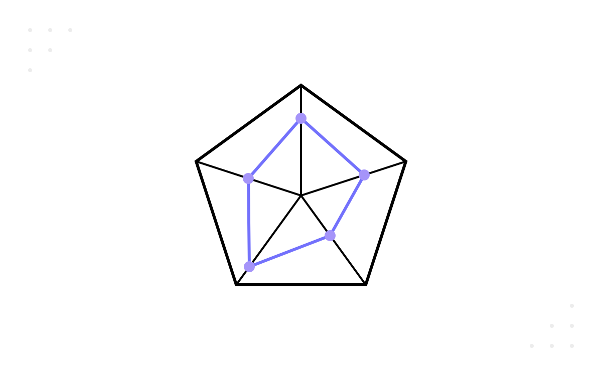
Every instrument in part 9 counts work items, and every instrument in the part before counts deployments. Not one of them counts the people. That omission is not a small gap at the edge of the dashboard; it is the reason the dashboard can be immaculate while the team underneath it is coming apart. The opening story of this series — the pristine metrics wall in front of the codebase everyone feared, with the two billing-module engineers booking their holidays apart like flight crews eating different meals — was a story about exactly this. Every number on that wall was a work-counting number. The people-shaped facts had nowhere to register, so they registered nowhere.
The framework that names this problem properly, rather than gesturing at it, is SPACE.
Six authors, five letters
SPACE was published in ACM Queue in 2021 by Nicole Forsgren, Margaret-Anne Storey, Chandra Maddila, Thomas Zimmermann, Jenna Butler and Brian Houck — a research group spanning GitHub, Microsoft Research and the University of Victoria. It deserves the full author list, not the usual one-name shorthand, partly as basic credit and partly because the breadth of the group is the point: this is a synthesis of productivity research by people who study developers for a living, not a vendor's dashboard taxonomy.
Their core argument, in my words: developer productivity is not one thing, so it cannot be one number. It has at least five distinct dimensions, and any measurement scheme that collapses them into a single figure — velocity, commit count, a composite “productivity score” — is not simplifying the truth but discarding most of it. The five dimensions give the framework its acronym, and everything below is my paraphrase of what each one covers; the dimension names are the authors', the wording is mine.
The five dimensions, in my own words
Satisfaction and well-being. Whether the work is sustainable and worth doing for the humans doing it — energy rather than exhaustion, pride in the output, a team its members would recommend to a friend. This dimension is the early-warning system for every other one: burnout shows up here quarters before it shows up in delivery.
Performance. Outcomes, as distinct from output. Not how much was produced but whether what shipped worked, got used, and mattered — quality, reliability, impact on the people the software is for. The hardest dimension to attribute to any individual or sprint, which is precisely why lazier schemes substitute activity for it.
Activity. The countable actions: commits, pull requests, builds, reviews, deployments. The easiest dimension to instrument, because the tooling emits it for free — and the least meaningful on its own, because volume says nothing about value. Activity data is legitimate as one signal among several; promoted to the whole story, it is part 1's theatre with a data pipeline attached.
Communication and collaboration. How information and work move between people: how quickly reviews come back, how findable expertise is, how well knowledge survives someone being on leave, how much of the team's bandwidth is consumed coordinating rather than building. Software is built by teams, and this dimension measures the connective tissue that the individual-shaped dimensions cannot see.
Efficiency and flow. The ability to make progress with minimal friction, delay and interruption — wait states, handoffs, the availability of unbroken stretches of concentration. This is the dimension where part 9's entire toolkit lives: flow time, flow efficiency and their relatives are all instruments pointed at it.
Lay the previous two parts over this map and the shape of the problem appears. By my reading, DORA and the flow metrics land almost entirely in Performance, Activity and Efficiency — the three dimensions that can be computed from systems of record. Satisfaction and Communication, the two dimensions that live in people rather than pipelines, are exactly the two that conventional delivery dashboards leave dark.
Three dials minimum
The paper's most practical recommendation is also its most quotable: measure across at least three of the five dimensions at once. My reading of why this works: the dimensions are designed to be in tension, and the tension is the safeguard. Any one dimension, optimised alone, degrades the others silently — activity climbs while performance sinks, efficiency improves while collaboration is starved, delivery accelerates while satisfaction erodes. Watch one dial and gaming it is invisible. Watch three, chosen from different dimensions, and the gaming of one shows up as deterioration on another. It is the same logic as part 1's rule about metrics informing decisions rather than judging people, expressed structurally: build the dashboard so that theatre on one instrument trips an alarm on a second.
Three is also a floor, not a ceiling — but in practice it is the useful number, because the marginal cost of the fourth and fifth dimension is high and the first three catch most of the distortions.
The two dimensions that resist the dashboard
Here is where I part company with the temptation to instrument everything, because the two dark dimensions are dark for structural reasons, not for lack of tooling effort.
Satisfaction resists dashboarding because it is self-reported, and self-reports bend under observation. The moment a well-being score visibly influences anything — a reorganisation, a manager's rating, a headcount decision — people manage the score, in either direction, and the signal is gone. It is Goodhart's law applied to feelings, and feelings adapt faster than code does. The numbers also lag: by the time a satisfaction survey turns red, the causes are old and the best people are already interviewing elsewhere.
Communication resists dashboarding for a different reason: the data exists, in abundance, and mining it is the problem. Review graphs, message metadata and meeting calendars would tell you a great deal about how a team collaborates — and harvesting them at individual grain is surveillance wearing a lanyard. This series has one non-negotiable rule, set in part 1: instruments point at systems, never at individuals. Most of what would make communication “measurable” breaks that rule at the first query.
What I do instead
So the two human dimensions get measured — but with deliberately blunt instruments, held at team grain, and read as trends. This is my practice, offered as such.
For satisfaction: a short anonymous pulse, a handful of questions, the same questions every time, run a few times a quarter. The stability matters more than the cleverness — I want a trend line, not a diagnosis, and I never act on a single reading. The qualitative channel does the real work: one-to-ones and retrospectives, with themes written down and scores refused. When the pulse trend and the retro themes point the same way, that is a finding; when they diverge, the conversation is the truth and the number is the noise.
For communication: I measure the system's connective tissue and leave the individuals alone. Review turnaround, measured as a property of the queue rather than of any reviewer — my working default is that a review should get a response within one working day, offered as my practice rather than as research. An occasional calendar audit: how much of the team's week is meetings, and which of those meetings produce decisions. And the bus-factor question from part 6, asked of knowledge rather than files: which topics does exactly one person answer questions about? None of this needs a live dashboard. All of it fits in a quarterly review, read next to the delivery numbers it exists to keep honest.
And one more instrument, free and reliable: the holiday calendar. When two specific engineers can never be on leave in the same fortnight, that is a bus-factor reading and a satisfaction reading in one, and no survey required.
The panel, complete
SPACE completes the instrument panel this half of the series has been assembling: DORA for the pipeline, flow for the value stream, and five dimensions — at least three watched at once — to stop the work-counting instruments from becoming the whole story. What none of these frameworks provides is the plumbing: the queries, widgets and definitions that turn a framework diagram into numbers arriving weekly without human ceremony. My teams live in Azure DevOps, and the next part is the unglamorous, load-bearing detail of what that platform will measure for you, on exactly which definitions, and where it stops. Next, capturing it all in Azure DevOps.